Thursday, February 3, 2022

What's in the Hathi Trust?

(This is a post I've had unpublished since writing it in 2016. Just hitting publish without reviewing right now because it's something I find myself periodically looking at the charts for).

As we get ready to launch the full Hathi Trust+Bookworm to allow tracking words across 13 million books, I've been working on fixing up the metadata from the original MARC records.

This is useful information to have for anyone using Hathi to find books; it's hard to know the general outlines of a collection like this. So what follows are some general outlines about what books are included in the Hathi Trust. This is closely related, by the way, to what books are included in Google Books; more on that below.

One hugely important question is where the books come from. Different libraries had different scanning agreements with Google, and collect differently. Medical terms show a sharp drop-off in Google Ngrams after 1922 not because they were used less in writing, but because Harvard's excellent medical library wasn't scanned by Google for post-1922 books. Hathi has some of the same issues in its scope; Harvard (dark blue) disappears after 1922 along with the New York Public, and the collection become largely Michigan (light orange) and California (light blue). A huge spike of misdated items from the year 1900 can be blamed mostly on California. The sharp contraction of size in the corpus after 1922 can partially be blamed on the libraries that disappear, but California too contributes fewer books. It will take some work to create a sample that is relatively consistent across the copyright line.

Books by originating library (top 10) by year. Click to enlarge.


Subject domains

Many of these libraries use the Library of Congress classification for their books: we've adopted it as the default subject classification for Bookworm because nothing else (subject headings, for example) is nearly so highly populated.

I was surprised to see how heavily represented two classifications are in the post-1920 period. DS, dark blue, is the history of Asia; PL, dark purple, is Asian Literature. After 1960 or so, both of these classes are larger than their American counterparts (E/F and PS). "Asia" is a much larger and more populated area; still, these indicate that the post-1970 Hathi collection has a less myopic view of the world than I might have expected from purely American universities.


 Book Scanners

Less surprising is the universe of scanners. One of the reasons to understand Hathi is that it's as close as we can get, in many ways, to knowing what's in Google books. The big difference is that Google includes many libraries not in Hathi (such as Oxford) and Hathi includes some books not in Google Books. As the visualization below makes clear though, the preponderance of books were scanned by Google, and only other organizations make a numerically significant contribution before 1922: the Internet Archive at a variety of libraries (green) and Microsoft at Cornell (red). (Note that I'm limiting he time scale here to just post-1815, not 1750)


 Languages

One major question about the default search under the new format is whether we'll restrict it to just English or make it cross language. As the LC classes indicated, there are two different worlds before and after copyright; pre-1922 is basically English (green), French (light blue), and German (dark blue), while post-1922 begins to bring in significant numbers of texts in Japanese and Chinese (dark and light orange) and Russian. Chinese in particular is a pretty substantial corpus; I'm curious to see if the tokenizers worked well enough to make this a useful tool.


Relative language usage tells the same story from a different angle: here the y axis is *percent* of the corpus, not absolute number of texts. (It narrows slightly after 1960 because language diversity increases). This makes clear that the corpus becomes more English dominated over time, and better acknowledges French and Latin as significant languages early in the corpus.

Sunday, February 10, 2019

How badly is Google Books search broken, and why?

I periodically write about Google Books here, so I thought I'd point out something that I've noticed recently that should be concerning to anyone accustomed to treating it as the largest collection of books: it appears that when you use a year constraint on book search, the search index has dramatically constricted to the point of being, essentially, broken.

Here's an example. While writing something, I became interested in the etymology of the phrase 'set in stone.' Online essays seem to generally give the phrase an absurd antiquity--they talk about Hammurabi and Moses, as if it had been translated from language to language for decades. I thought that it must be more recent--possibly dating from printers working with lithography in the 19th century.

So I put it into Google Ngrams. As it often is, the results were quite surprising; about 8,700 total uses in about 8,000 different books before 2002, the majority of which are after 1985. Hammurabi is out, but lithography doesn't look like a likely origin for widespread popularity either.

That's much more modern that I would have thought--this was not a pat phrase until the 1990s. That's interesting, so I turned to Google Books to find the results. Of those 8,000 books published before 2002, how many show up in the Google Books search result with a date filter before 2002?

Just five. Two books that have "set in stone" in their titles (and thus wouldn't need a working full-text index), one book from 2001, and two volumes of the Congressional record. 99.95% of the books that should be returned in this search--many of which, in my experience, were generally returned four years ago or so--have vanished.


Many of these books *do* still exist in the HathiTrust index.

Changing the date does not produce the results you'd expect, either. "Set in stone" with a date filter set before 1990 returns *nothing*, with a single non-book result returned from a 1982 Washington Post article that has wandered into the Google index. This is especially interesting, because it means that the displayed representation of the two congressional serial's volumes dates as being 1900 is *not* being used for the purpose of retrieval. This is probably wise: books listed as being published in 1900 in the library catalogs feeding into Google can be from any time. Choosing a date before 2020 (which should return all books) adds only a few books to the 2002 listing.

When you search for the term with no date restrictions, Google claims to be returning 100,000-ish results. I have no way of assessing if this is true; but scrolling through results, they do include a few pre-1990 books that didn't show up in the earlier searches.

What's going on? I don't know. I guess I blame the lawyers: I suspect that the reasons have to do with the way the Google books project has become a sort of Herculaneum-on-the-Web, frozen in time at the moment that anti-Books lawsuits erupted in earnest 11 years ago. The site is still littered with pre-2012 branding and icons, and the still-live "project history" page ends with the words "stay tuned..." after describing their annual activity for 2007.


So possibly Google has one year it displays for books online as a best guess, and another it uses internally to represent the year they have legal certainty a book is released. So maybe those volumes of the congressional record have had their access rolled back as Google realized that 1900 might actually mean 1997; and maybe Google doesn't feel confident in library metadata for most of its other books, and doesn't want searchers using date filters to find improperly released books.

Oddly, this pattern seems to work differently on other searches. Trying to find another rare-ish term in Google Ngrams, I settled on "rarely used word"; the Ngrams database lists 192 uses before 2002. Of those, 22 show up in the Google index. A 90% disappearance rate is bad, but still a far cry from 99.95%.

So we can't even know how bad the uncertainty is. One intriguing possibility is that the searches I'm using are themselves caught up in the algorithms used to classify books. If I worked at Google, I would have implemented a text-based date-prediction algorithm to flag erroneously classified books. (I have actually done this and sent a list to the HathiTurst of books they may have erroneously released into the public domain. It works). If they use trigrams, it's possible that a term like "set in stone," because of its recency, might *itself* be pushing a bunch of 20th century books into the realm of uncertainty.

Partly this is the story that we all know: Google Books has failed to live up to its promise as the company has moved away from its original mission of organizing information for people. But the particular ways that it has actually eroded, including this one, are worth documenting, because it's easy to think that search tools that worked perfectly well a few years ago won't have been consciously degraded.

Thursday, August 23, 2018

Some preliminary analysis of the Texas salary-by-major data.

I did a slightly deeper dive into data about the salaries by college majors while working on my new Atlantic article on the humanities crisis. As I say there, the quality of data about salaries by college major has improved dramatically in the last 8 years. I linked to others' analysis of the ACS data rather than run my own, but I did some preliminary exploration of salary stuff that may be useful to see.

That all this salary data exists is, in certain ways, a bad thing--it reflects the ongoing drive to view college majors purely through return on income, without even a halfhearted attempt to make the results valid. (Randomly assign students into college majors and look at their incomes, and we'd be talking; but it's flabbergasting that anyone thinks that business majors often make more than English majors because their education prepared them to, rather than that the people who major in business, you know, care more about money than English majors do.

Friday, July 27, 2018

Mea culpa: there *is* a crisis in the humanities

NOTE 8/23: I've written a more thoughtful version of this argument for the Atlantic. They're not the same, but if you only read one piece, you should read that one.

Back in 2013, I wrote a few blog post arguing that the media was hyperventilating about a "crisis" in the humanities, when, in fact, the long term trends were not especially alarming. I made two claims them: 1. The biggest drop in humanities degrees relative to other degrees in the last 50 years happened between 1970 and 1985, and were steady from 1985 to 2011; as a proportion of the population, humanities majors exploded. 2) The entirety of the long term decline from 1950 to 2010 had to do with the changing majors of women, while men's humanities interest did not change.

I drew two inference from this. The first was: don't panic, because the long-term state of the humanities is fairly stable. Second: since degrees were steady between 1985 and 2005, it's extremely unlikely that changes in those years are responsible for driving students away. So stop complaining about "postmodernism," or African-American studies: the consolidation of those fields actually coincided with a long period of stability.

I stand by the second point. The first, though, can change with new information. I've been watching the data for the last five years to see whether things really are especially catastrophic for humanities majors. I tried to hedge my bets at the time: 

It seems totally possible to me that the OECD-wide employment crisis for 20-somethings has caused a drop in humanities degrees. But it's also very hard to prove: degrees take four years, and the numbers aren't yet out for the students that entered college after 2008.
But I may not have hedged it enough. The last five years have been brutal for almost every major in the humanities--it's no longer reasonable to speculate that we are fluctuating around a long term average. So at this point, I want to explain why I am now much more pessimistic about the state of humanities majors than I was five years ago. I'll show a few charts, but here's the one that most inflects my thinking.


Tuesday, July 10, 2018

Google Books and the open web.

Historians generally acknowledge that both undergraduate and graduate methods training need to teach students how to navigate and understand online searches. See, for example, this recent article in Perspectives.  Google Books is the most important online resource for full-text search; we should have some idea what's in it.

A few years ago, I felt I had some general sense of what was in the Books search engine and how it works. That sense is diminishing as things change more and more. I used to think I had a sense of how search engines work: you put in some words or phrases, and a computer traverses a sorted index to find instances of the word or phrase you entered; it then returns the documents with the highest share of those words, possibly weighted by something like TF-IDF.

Nowadays it's far more complicated than that. This post is just some notes on my trying to figure out one strange Google result, and what it says about how things get returned.


Wednesday, June 13, 2018

Meaning chains with word embeddings

Matthew Lincoln recently put up a Twitter bot that walks through chains of historical artwork by vector space similarity. https://twitter.com/matthewdlincoln/status/1003690836150792192.
The idea comes from a Google project looking at paths that traverse similar paintings.

This reminds that I'd meaning for a while to do something similar with words in an embedding space. Word embeddings and image embeddings are, more or less, equivalent; so the same sorts of methods will work on both. There are--and will continue to be!--lots of interesting ways to bring strategies from convoluational image representations to language models, and vice versa. At first I though I could just drop Lincoln's code onto a word2vec model, but the paths it finds tend to oscillate around in the high dimensional space more than I'd like. So instead I coded up a new, divide and conquer strategy using the Google News corpus. Here's how it works.


Friday, September 15, 2017

"Peer review" is younger than you think. Does that mean it can go away?

This is a blog post I've had sitting around in some form for a few years; I wanted to post it today because:

1) It's about peer review, and it's peer review week! I just read this nice piece by Ken Wissoker in its defense.
2) There's a conference on argumentation in Digital History this weekend at George Mason which I couldn't attend for family reasons but wanted to resonate with at a distance. 

It's still sketchy in places, but I'm putting it up as a provocation to think (and to tell me) more about the history of peer review, and how fundamentally malleable scholarly norms are, rather than as a completed historical essay in its own right. [Edit--for a longer and better-informed version of many of these points, particularly as they relate to the sciences, Konrad Lawson points out this essay by Aileen Fyfe; my old grad school colleague Melinda Baldwin has an essay in Physics Today from her forthcoming project that covers the whole shebang as well, with a particular emphasis on physics.]

It's easy, when writing about "the digital," to become foolishly besotted by the radical transformation it offers. There's sometimes a millenarian strand in the digital humanities that can be dangerous, foolish, or both, and which critics of the field occasionally seize on as evidence of its perfidy. But it's just as great a betrayal of historical thinking to essentialize the recent past as to hope that technology lets us uproot the past. We should not fall short of imagining the changes that are possible in the disciplines; and we shouldn't think that disciplines need revolve around particular ways of reviewing, arguing, or producing scholarship.

Here's a short historical story about one thing we tend to essentialize, peer review. I find it useful for illustrating two things. The first is that scholarly concepts we think of as central to the field are often far more recent than we think. This is, I think, a hopeful story; it means the window for change may also be greater than we think. The second is that they are, indeed, intricately tied up with social and technological changes in living memory; the humanities are not some wonderful time container of practices back to Erasmus or even Matthew Arnold. I'm posting it now, after delivering it as a hand-wavy talk at Northeastern in 2015. 

Monday, July 24, 2017

Population Density 2: Old and New New England

Digging through old census data, I realized that Wikipedia has some really amazing town-level historical population data, particularly for the Northeast, thanks to one editor in particular typing up old census reports by hand. (And also for French communes, but that's neither here nor there.) I'm working on pulling it into shape for the whole country, but this is the most interesting part.


Tuesday, July 11, 2017

Population Density 1: Do cities have a land area? And a literal use of the Joy Division map

I've been doing a lot of reading about population density cartography recently. With election-map cartography remaining a major issue, there's been lots of discussion of them: and the "Joy Plot" is currently getting lots of attention.

So I thought I'd finally post some musings I wrote up last month about population density, the built environment, and this plot I made of New York City building height:

This chart appears at the bottom of this post, but bigger!

Wednesday, July 5, 2017

What is described as belonging to the "public" versus the "government?"

Robert Leonard has an op-ed in the Times today that includes the following anecdote:
Out here some conservatives aren’t even calling them “public” schools anymore. They call them “government schools,” as in, “We don’t want to pay for your damn ‘government schools.’ ” They’re afraid to send their kids to them.
I'm pretty interested in the process of objects shifting from belonging to the "public" to the "government." In my 2015 interactive at the Atlantic about State of the Union addresses, I highlighted the decline of "public" from one of the most common words out of president's mouths into a comparatively rare one. And this is a shift that large digital libraries can help us better understand.

Tuesday, May 16, 2017

A brief visual history of MARC cataloging at the Library of Congress.

The Library of Congress has released MARC records that I'll be doing more with over the next several months to understand the books and their classifications. As a first stab, though, I wanted to simply look at the history of how the Library digitized card catalogs to begin with.


A couple notes for the technically inclined:
1. the years are pulled from field 260c (or if that doesn't exist or is unparseable, from field 008). Years in non-western calendars are often not converted correctly.
2. There are obviously books from before 1770, but they aren't included.
3. By "books", I mean items in the LC's recently-released retrospective (to 2014) "Books all" MARC files. http://www.loc.gov/cds/products/product.php?productID=5. Not the serial, map, etc. files: the total number is just over 10 million items.

See after the break for the R code to create the chart and the initial version Jacob is talking about in the comments.

Friday, April 14, 2017

The history of looking at data visualizations

One of the interesting things about contemporary data visualization is that the field has a deep sense of its own history, but that "professional" historians haven't paid a great deal of attention to it yet. That's changing. I attended a conference at Columbia last weekend about the history of data visualization and data visualization as history. One of the most important strands that emerged was about the cultural conditions necessary to read data visualization. Dancing around many mentions of the canonical figures in the history of datavis (Playfair, Tukey, Tufte) were questions about the underlying cognitive apparatus with which humans absorb data visualization. What makes the designers of visualizations think that some forms of data visualization are better than others? Does that change?

There's an interesting paradox about what the history of data visualization shows. The standards for data visualization being good change seem to change over time. Preferred color schemes, preferred geometries, and standards about the use of things like ideograms change over time. But, although styles change, the justifications for styles are frequently cast in terms of science or objective rules. People don't say "pie charts are out this decade"; they say, "pie charts are objectively bad at displaying quantity."  A lot of the most exciting work in the computer science side of information visualization is now trying to make the field finally scientific. It works to bring scientific research into perception from mere style, like the influential and frequently acerbic work of Tableau's Robert Kosara; or to precisely identify what a visualization is supposed to do (be memorable? promote understanding?) like the work of Michelle Borkin, my colleague at Northeastern, so that the success of different elements can be measured.

I think basically everyone who's thought about it agrees that good data visualization is not simply art and not simply science, but the artful combination of both. To make a good data visualization you have to both be creative, and understand the basic perceptual limits on your viewer. So you might think that I'm just saying: the style changes, but the science of perception remains the same.

That's kind of true: but what's interesting about thinking historically about data visualization is that the science itself changes over time, so that both what's stylistically desirable and what a visualization's audience has the cognitive capacity to apprehend changes over time. Studies of perception can tap into psychological constants, but they also invariable hit on cultural conditioning. People might be bad at judging angles in general, but if you want to depict a number that runs on a scale from 1 to 60, you'll get better results by using a clock face because most people spend a lot of time looking at analog clocks and can more or less instantly determine that a hand is pointing at the 45. (Maybe this example is dated by now. But that's precisely the point. These things change; old people may be better at judging clock angles than young people.)

This reminds me of the period I studied in my dissertation, the period in the 1921s-1950s when advertisers and psychologists attempted to measure the graphical properties of an attention-getting advertisement. Researchers worked to understand the rules of whether babies or beautiful drew more attention, whether the left or the right side of the page was more viewed; but whether a baby grabs attention depends as much on how many other babies are on the page as on how much the viewer loves to look at babies. The canniest copywriters did better following their instinct because they understood that the attention economy was always in flux, never in equilibrium.

So one of the most interesting historical (in some ways art-historical) questions here is: are the conditions of apprehension of data visualization changing? Crystal Lee gave a fascinating talk at the conference about the choices that Joseph Priestley made in his chart of history; I often use in teaching Joseph Priestley's description of his chart of biography, which uses several pages to justify the idea of timeline. In the extensive explanation, you can clearly see Priestley pushing back at contemporaries who found the idea of time on the x-axis unclear, or odd to understand.

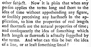
This seems obvious: so why did Priestley take pages and pages to make the point?

That doesn't mean that "time-as-the-x-axis" was impossible for *everyone* to understand: after all, Priestley's timelines were sensations in the late 18th century. But there were some people who clearly found it very difficult to wrap their heads around, in much the same way that--for instance--I find many people have a lot of trouble today with the idea that the line charts in Google Ngrams are insensitive to the number of books published in each year because they present a ratio rather than an absolute number. (Anyone reading this may have trouble themselves believing that this is hard to understand or would require more than a word of clarification. For many, it does.) 

That is to say: data visualizations create the conditions for their own comprehension. Lauren Klein spoke about a particularly interesting case of this, Elizabeth Peabody's mid-19th century pedagogical visualizations of history, which depict each century as a square, divided into four more squares, each divided into 25 squares, and finally divided into 9 more for a total of 900 cells.

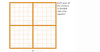
Peabody's grid, explanation: http://shapeofhistory.net/

There's an oddly numerological aspect to this division that draws it structures by the squares of the first three primes; Manan Ahmed suggested that it drew on a medieval manuscript tradition of magic squares.


Old manuscript from pinterest: I don't really know what this is. But wow, squares within squares!

Klein has created a fully interactive recreation of Peabody's visualization online here, with original sources. Her accompanying argument (talk form here), which I think is correct, includes the idea that Peabody deliberately engineered a "difficult" data visualization because she wanted a form that would promote reflection and investment, not something that would make structures immediately apparent without a lot of cognition.

Still, one of the things that emerged again and again in the talks was how little we know about how people historically read data visualizations. Klein's archival work demonstrates that many students had no idea what to do with Peabody's visualizations; but there's an interesting open question about whether they were easier to understand then than they are now?

The standard narrative of data visualization, insofar as there is one, is of steadily increasing capacity as data visualizations forms become widespread. (The more scientific you are, I guess, the more you might also believe in constant capacity to apprehend data visualizations.) Landmark visualizations, you might think, introduce new forms that expand our capacity to understand quantities spatially. Michael Friendly's timeline of milestone visualizations, which was occasionally referenced, lays out this idea fairly clearly; first we can read maps, then we learn to read timelines, then arbitrary coordinate charts, then boxplots; finally in the 90s and 00s we get treemaps and animated bubble charts, with every step expanding our ability to interpret. These techniques help expand understanding both for experts and, through popularizers (Playfair, Tufte, Rosling), the general public.

What that story misses are the capacities, practices, and cognitive abilities that were lost. (And the roads not taken, of course; but lost practices seem particularly interesting).

So could Peabody's squares have made more sense in the 19th century? Ahmed's magic squares suggest that maybe they were. I was also struck by the similarity to a conceptual framing that some 19th-century Americans would have known well; the public land survey system that, just like Peabody's grid, divided its object (most of the new United States) into three nested series of squares.


Did Peabody's readers see her squares in terms of magic squares or public lands? It's very hard--though not impossible--to know. It's hard enough to get visualization creators nowadays to do end-user testing; to hope for archival evidence from the 19th century is a bridge too far.

But it's certainly possible to hope for evidence; and it doesn't seem crazy to me to suggest that the nested series of squares used to be a first-order visualization technique that people could understand well, that has since withered away to the point where the only related modern form is the rectangular treemap, which is not widely used and lacks the mystical regularity of the squares.

I'm emphatically not saying that 'nested squares are a powerful visualization technique professionals should use more.' Unless your audience is a bunch of Sufi mystics just thawed out of a glacier in the Elburz mountains, you're probably better off with a bar chart. I am saying that maybe they used to be; that our intuitions about how much more natural a hierarchical tree are might be just as incorrect as our intuitions about whether left-to-right or right-to-left is the better direction to organize text.

From the data visualization science side, this stuff may be interesting because it helps provide an alternative slate of subjects for visualization research. Psychometry more generally knows it has a problem with WEIRD (Western, educated, industrialized, rich and democratic) subjects. The data visualization literature has to grapple with the same problem; and since Tufte (at least) it's looked to its own history as a place to find the conditions of possible. If it's possible to change what people are good at reading, that both suggests that "hard" dataviz might be more important than "easy" dataviz, and that experiments may not run long enough (decades?) to tell if something works. (I haven't seen this stuff in the dataviz literature, but I also haven't gone looking for it. I suspect it must exist in the medical visualization literature, where there are wars about whether it's worthwhile to replace old colorschemes in, say, an MRI readout that are perceptually suboptimal but which individual doctors may be )

From the historical side, it suggests a lot of interesting alignments with the literature. The grid of the survey system or Peabody's maps is also the "grid" Foucault describes as constitutive of early modern theories of knowledge. The epistemologies of scientific image production in the 19th century are the subject of one of the most influential history of science books of the last decade, Daston and Gallison's Objectivity. The intersections are rich and considerably more explored, from what I've seen well beyond history of science into fields like communications. I'd welcome any references here, too, particularly if they're not to the established, directly relevant field of the history of cartography. (Or the equally vast field of books Tony Grafton wrote.)

That history of science perspective was well represented at Columbia, but an equally important discipline was mostly absent. These questions of aesthetics and reception in visualization feel to me a lot like art-historical questions; there's a useful analogy between understanding how a 19th century American read a population bump chart, and understanding how a thirteenth century Catholic read a stained glass window. But most of the people I know writing about visualization are exiles from studying either texts or numbers, not from art history. External excitement about the digital humanities tends to get too excited about interdisciplinarity between the humanities and sciences and not excited enough about bridging traditions inside the humanities; one of the most interesting areas in this field going forward may be bridging the newfound recognition of the significance of data visualization as a powerful form of political rhetoric and scientific debate with a richer vocabulary for talking about the history of reading images.

Friday, December 23, 2016

Some notes on corpora for diachronic word2vec

I want to post a quick methodological note on diachronic (and other forms of comparative) word2vec models.

This is a really interesting field right now. Hamilton et al have a nice paper that shows how to track changes using procrustean transformations: as the grad students in my DH class will tell you with some dismay, the web site is all humanists really need to get the gist.

Semantic shifts from Hamilton, Leskovec, and Jurafsky

I think these plots are really fascinating and potentially useful for researchers. Just like Google Ngrams lets you see how a word changed in frequency, these let you see how a word changed in *context*. That can be useful in all the ways that Ngrams is, without necessarily needing a quantitative, operationalized research question. I'm working on building this into my R package for building and exploring word2vec models: here, for example, is a visualization of how the use of the word "empire" changes across five time chunks in the words spoken on the floor of the British parliament (i.e., the Hansard Corpus). This seems to me to be a potentially interesting way of exploring a large corpus like this.


Tuesday, December 20, 2016

OCR failures in 2016

This is a quick digital-humanities public service post with a few sketchy questions about OCR as performed by Google.

When I started working intentionally with computational texts in 2010 or so, I spent a while worrying about the various ways that OCR--optical character recognition--could fail.

But a lot of that knowledge seems to have become out of date with the switch to whatever post-ABBY, post-Tesseract state of the art has emerged.

I used to think of OCR mistakes taking place inside of the standard ASCII character set, like this image from Ted Underwood I've used occasionally in slide decks for the past few years:


But as I browse through the Google-executed OCR, I'm seeing an increasing number of character-set issues that are more like this, handwritten numbers into a mix of numbers and Chinese characters.


Thursday, December 1, 2016

A 192-year heatmap of presidential elections with a y axis ordering you have to see to believe

Like everyone else, I've been churning over the election results all month. Setting aside the important stuff, understanding election results temporally presents an interesting challenge for visualization.

Geographical realignments are common in American history, but they're difficult to get an aggregate handle on. You can animate a map, but that makes comparison through time difficult. (One with snappy music is here). You can make a bunch of small multiple maps for every given election, but that makes it quite hard to compare a state to itself across periods. You can make a heatmap, but there's no ability to look regionally if states are in alphabetical order.

This same problem led me a while ago to try and determine the best linear ordering of US states for data visualizations. I came up with a trick for combining some research on hierarchical and traditional census regions, which yields the following order:

This keeps every census-defined region (large and small) in a block, and groups the states sensibly both within those groups and across them.

Applied to election results, this allows a visualization that can be read both at the state and regional level (like a map) but also horizontally across time. Here's what that looks like: if you know something about the candidates in the various elections, it can spark some observations. Mine are after the image. Note that red/blue (or orange/blue) here are not the *absolute* winner, but the relative winner. Although Hillary Clinton won the national popular vote, and she won New Hampshire in 2016, for example, New Hampshire is red because it was more Republican than the nation as a whole.

Click to enlarge